Customizing the iTwin Viewer - "The Basics"
Introduction
This tutorial will take you through the first steps of customizing your iTwin Web Viewer. First you will learn how to add a new user interface component. Later you will customize that component to change the background color of your viewer.
Info
Skill level:
Basic
Duration:
30 minutes
Prerequisites
This tutorial assumes that you already have:
1. Add new iTwin Web Viewer interface component
The iTwin Web Viewer viewer template generates several files. To start with, let’s take a look at the App.tsx file. This is where you should start in customizing your iTwin Viewer.
To start with App.tsx contains a single react functional component fittingly called App. The App component is responsible for:
- Authenticating the user
- Rendering the
Viewercomponent
At the bottom of App.tsx you can see the return statement where the Viewer component is configured. Let’s focus on that for now.
Return statement of App.tsx where the Viewer component is configured
return (
    <div className="viewer-container">
      {!accessToken && (
        <FillCentered>
          <div className="signin-content">
            <ProgressLinear indeterminate={true} labels={["Signing in..."]} />
          </div>
        </FillCentered>
      )}
      <Viewer
        iTwinId={iTwinId}
        iModelId={iModelId}
        authClient={authClient}
        viewCreatorOptions={viewCreatorOptions}
        enablePerformanceMonitors={true} // see description in the README (https://www.npmjs.com/package/@itwin/web-viewer-react)
      />
    </div>
  );
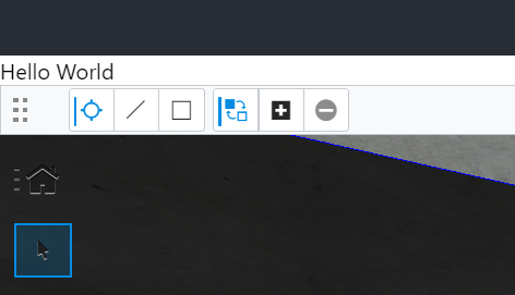
App is just a react component. Like any react component, it returns JSX to tell react how to create HTML for the browser to render. Let’s start off by adding some custom code to our JSX. We can render a “Hello World” span above the viewer by simply creating the element above the component. Note that this needs to be surrounded in a div per the single parent rule for react.
Viewer component with "Hello World" span
<div style={{ height: '100%' }}>
  <span>"Hello World"</span>
    <Viewer
      iTwinId={iTwinId}
      iModelId={iModelId}
      authClient={authClient}
      viewCreatorOptions={viewCreatorOptions}
      enablePerformanceMonitors={true} // see description in the README (https://www.npmjs.com/package/@itwin/web-viewer-react)
    />
</div>
2. Your first UI Widget
So far, we haven’t done anything to change the way the viewer works. We’ve only just added a new span element above the viewer. To add our “Hello World” span into the viewer, we need to pass the uiProviders prop to the Viewer component.
The uiProviders prop is typed to require an array of objects that implements the UIItemsProvider interface. Passing in the array will allow us to extend the Viewer with custom UI components. To do that, we need to define our MyFirstUiProvider class so that it implements the UiItemsProvider interface. Our new provider will tell the Viewer to include our “Hello world” span within the view.
Passing uiProviders prop to Viewer component
<Viewer
      iTwinId={iTwinId}
      iModelId={iModelId}
      authClient={authClient}
      viewCreatorOptions={viewCreatorOptions}
      enablePerformanceMonitors={true} // see description in the README (https://www.npmjs.com/package/@itwin/web-viewer-react)
      uiProviders={[new MyFirstUiProvider()]}
    />
Create a new file called MyFirstUiProvider.tsx with contents shown in a code snippet.
Let’s review that code. We’ve defined our new MyFirstUiProvider class. In the new class we’ve defined public readonly id which is required to distinguish between different providers. Then notice that we’ve defined just one function called provideWidgets. This function will be called several times as the Viewer is building up the user interface. We will return an empty array except for when the location is equal to StagePanelLocation.Right and section is equal to StagePanelSection.Start. In that case, we will return a single widget that will supply our “Hello World” span.
Our helloWidget consists of three attributes:
id- used to uniquely identify the widgetlabel- description label for our widgetgetWidgetContent()- returns our custom UI component
"MyFirstUiProvider.tsx" file content
import {
    StagePanelLocation,
    StagePanelSection,
    StageUsage,
    UiItemsProvider,
    Widget,
} from '@itwin/appui-react';

export class MyFirstUiProvider implements UiItemsProvider {
  public readonly id = 'MyFirstProviderId';

  public provideWidgets(
      _stageId: string,
      stageUsage: string,
      location: StagePanelLocation,
      section?: StagePanelSection
    ): ReadonlyArray<Widget> {
      const widgets: Widget[] = [];
      if (
        stageUsage === StageUsage.General &&
        location === StagePanelLocation.Right &&
        section === StagePanelSection.Start
      ) {
        const helloWidget: Widget = {
          id: 'HelloWidget',
          label: 'Hello',
          content: <span>"Hello World"</span>
        };
        widgets.push(helloWidget);
    }
    return widgets;
  }
}
At this point we need to import MyFirstUiProvider at the top of file App.tsx.
MyFirstUiProvider import
import { MyFirstUiProvider } from "./MyFirstUiProvider";
Finally, let’s clean up the span and div that we added directly into the App component earlier.
Return statement in App.tsx should look like this:
return (
    <div className="viewer-container">
      {!accessToken && (
        <FillCentered>
          <div className="signin-content">
            <ProgressLinear indeterminate={true} labels={["Signing in..."]} />
          </div>
        </FillCentered>
      )}
      <Viewer
        iTwinId={iTwinId}
        iModelId={iModelId}
        authClient={authClient}
        viewCreatorOptions={viewCreatorOptions}
        enablePerformanceMonitors={true} // see description in the README (https://www.npmjs.com/package/@itwin/web-viewer-react)
        uiProviders={[new MyFirstUiProvider()]}
      />
    </div>
  );
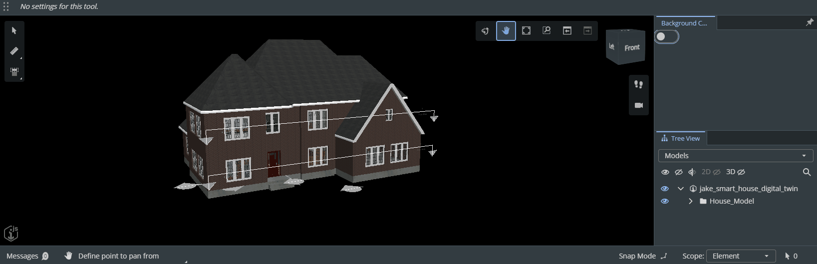
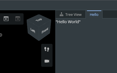
2.1 Result
Now we have our “Hello World” span displaying in a panel within the Viewer component. It should look like this:
3. Beyond Hello World
Saying hello to the world can be fun but we need to get past that. For this next step we’ll swap out our trivial helloWidget with something a little more interactive: a ToggleSwitch. Eventually this toggle will control the background color, so we’ll name our new widget backgroundColorWidget. Instead of returning a span we’ll return a ToggleSwitch.
Start by navigating back to MyFirstUiProvider.tsx and adding an import for ToggleSwitch at the top of the file.
ToggleSwitch import
import { ToggleSwitch } from '@itwin/itwinui-react';
Next switch out the helloWidget with the new backgroundColorWidget.
Switch out the helloWidget with the new backgroundColorWidget
if (
  stageUsage === StageUsage.General &&
  location === StagePanelLocation.Right &&
  section === StagePanelSection.Start
) {
  const backgroundColorWidget: Widget = {
      id: 'BackgroundColorWidget',
      label: 'Background Color Toggle',
      content: <ToggleSwitch />
  };
  widgets.push(backgroundColorWidget);
}
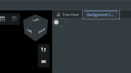
Notice the only significant difference is that getWidgetContent is now returning a ToggleSwitch. It doesn’t do anything interesting yet, but it should look like this:
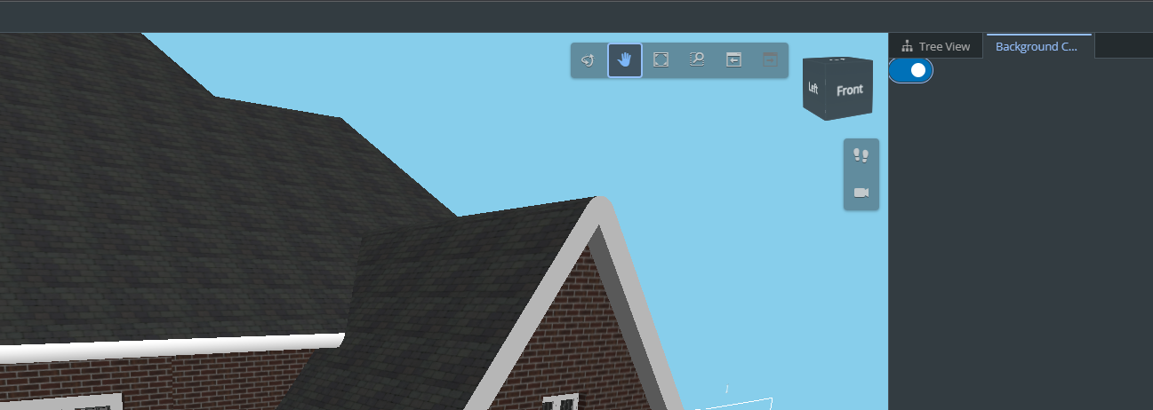
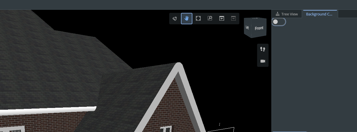
4. Changing the background color
For this last step, let’s put our new toggle to work. We want the toggle to control the background color in the view of our house iModel. When the toggle is on, we’ll override the background color to “skyblue”. When the toggle is off, we’ll change the background color back to its original color.
To do this, we need to pass the onChange prop to the ToggleSwitch component.
Passing the onChange prop to the ToggleSwitch component
return (
  <ToggleSwitch
    onChange={(e) => {
      if (MyFirstUiProvider.toggledOnce === false) {
        MyFirstUiProvider.originalColor =
          IModelApp.viewManager.selectedView!.displayStyle.backgroundColor.tbgr;
        MyFirstUiProvider.toggledOnce = true;
      }

      const color = e.target.checked
        ? ColorDef.computeTbgrFromString("skyblue")
        : MyFirstUiProvider.originalColor;

      IModelApp.viewManager.selectedView!.overrideDisplayStyle({
        backgroundColor: color,
      });
    }}
  />
);
Since we’re using two new static variables here, we need to add this to to our MyFirstUiProvider class at the beginning of our definition.
Adding toggledOnce and originalColor variables to MyFirstUiProvider class
export class MyFirstUiProvider implements UiItemsProvider {
  public readonly id = 'HelloWorldProvider';
  public static toggledOnce: boolean = false;
  public static originalColor: number;
The first condition checks for only the first trigger of the toggle using boolean toggledOnce. If true, we need to store the original color in static variable MyFirstUiProvider.originalColor. We are using the global singleton IModelApp to get to the viewManager that can provide the current backgroundColor. We also need to flip variable MyFirstUiProvider.toggledOnce to true to make sure we only store the original color once.
Notice we’re using the function overrideDisplayStyle() on the currently selected view. To get the view, we use the same global singleton IModelApp to get to the viewManager.
Our completed MyFirstUiProvider.tsx file should look similar to the one shown in a code snippet.
Completed MyFirstUiProvider.tsx file
import { ColorDef } from '@itwin/core-common';
import { IModelApp } from '@itwin/core-frontend';
import {
  StagePanelLocation,
  StagePanelSection,
  StageUsage,
  UiItemsProvider,
  Widget,
} from '@itwin/appui-react';
import { ToggleSwitch } from "@itwin/itwinui-react";

export class MyFirstUiProvider implements UiItemsProvider {
  public readonly id = 'HelloWorldProvider';
  public static toggledOnce: boolean = false;
  public static originalColor: number;

  public provideWidgets(
    _stageId: string,
    stageUsage: string,
    location: StagePanelLocation,
    section?: StagePanelSection
  ): ReadonlyArray<Widget> {
    const widgets: Widget[] = [];
    if (
      stageUsage === StageUsage.General &&
      location === StagePanelLocation.Right &&
      section === StagePanelSection.Start
    ) {
      const backgroundColorWidget: Widget = {
        id: 'BackgroundColorWidget',
        label: 'Background Color Toggle',
        content: <ToggleSwitch
          onChange={(e) => {
            if (MyFirstUiProvider.toggledOnce === false) {
              MyFirstUiProvider.originalColor =
                IModelApp.viewManager.selectedView!.displayStyle.backgroundColor.tbgr;
              MyFirstUiProvider.toggledOnce = true;
            }
            const color = e.target.checked
              ? ColorDef.computeTbgrFromString("skyblue")
              : MyFirstUiProvider.originalColor;

            IModelApp.viewManager.selectedView!.overrideDisplayStyle({
              backgroundColor: color,
            });
          }}
        />
      };
      widgets.push(backgroundColorWidget);
    }
    return widgets;
  }
}