Adding showcase widgets to your iTwin Viewer
Introduction
This tutorial takes widgets from the sample showcase and adds them to your iTwin Viewer using the uiProviders prop.
Info
Skill level:
Basic
Duration:
30 minutes
Prerequisites
This tutorial assumes that you already have:
- Explored the Sample Showcase.
- Created your own iTwin Web Viewer based on the Web Application Quick Start.
- Configured your iTwin Viewer with the House Model sample iModel.
- Instructions to use this sample iModel can be found at the create iModel sample tutorial.
- Understand the concept of a UiItemsProvider and how to add widgets on a UiItemsProvider to an iTwin Viewer.
- Completed the “Customizing the iTwin Viewer” tutorial.
1. Understanding the Sample Showcase
We hope you have given the Sample Showcase a tour and enjoyed the many samples provided. You may want to use some of these samples in your own iTwin Viewer. To do so you first need to understand how the showcase works.
If we take a closer look at the files involved in each sample, notice they all follow the same pattern containing a few important files:
[SampleName]App.tsx- Corresponds toApp.tsxin the iTwin Viewer template and provides the mainViewercomponent.[SampleName]Widget.tsx- Defines theUiItemsProviderthat will be passed into propuiProvidersfor our sample widget component. This widget is the controller for our samples.[SampleName]Api.ts- Defines widget functionality that uses the iTwin.js API being showcased.[SampleName].scss- Defines the styles in our css classes used inside the widget.
Given this pattern, it’s simple to identify the parts required to bring our sample showcase to your iTwin Viewer. The component revolves around the [SampleName]Widget.tsx file so we need to copy all the files associated with our custom widgets UiItemsProvider and pass it in the Viewer component.
2. Example using a sample
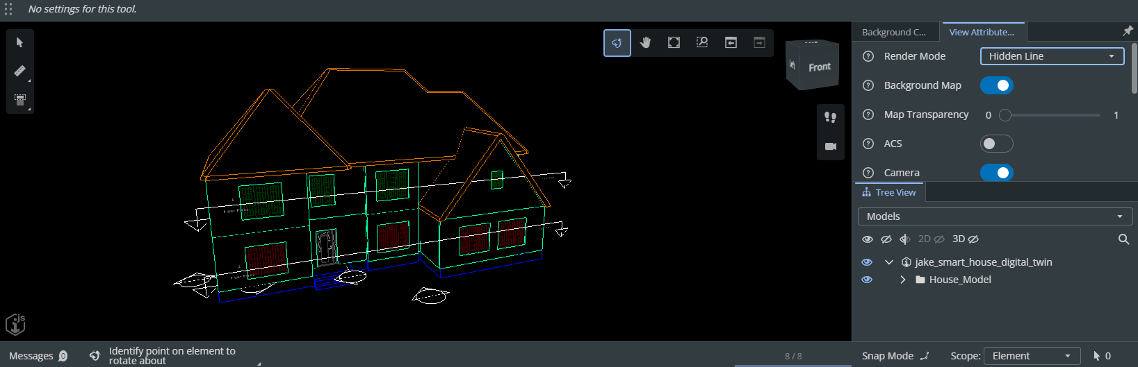
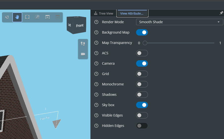
For this tutorial, we will be taking the widget from sample View Attributes and adding it into our iTwin Viewer.
The two lines shown in the code snippet are the only lines you will need to add in your iTwin Viewer in App.tsx.
Lines you need to add in your iTwin Viewer in `App.tsx`
... // Import the widget provider
import { ViewAttributesWidgetProvider } from "./ViewAttributesWidget";

... // Pass the imported UiProvider into the uiProvider prop in the <Viewer /> component
<Viewer
  ...
  uiProviders={[new ViewAttributesWidgetProvider()]}
/>
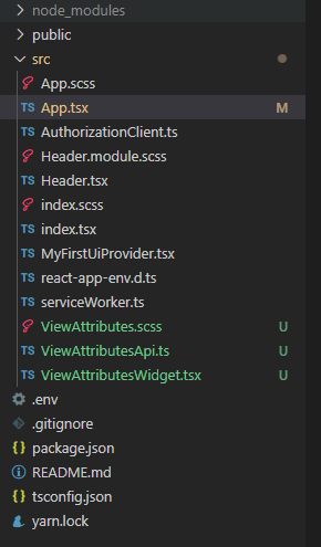
We need to copy these three files to bring our widget over.
ViewAttributesApi.tsViewAttributesWidget.tsxViewAttributes.scss
ViewAttributes.scss
.sample-options {
    box-sizing: border-box;
    width: 100%;
    height: 100%;
    padding: 8px;
    display: grid;
    row-gap: 16px;
    grid-template-columns: 1fr;
    grid-template-rows: 1fr min-content;
    max-width: 1200px;
    margin: auto;

    .sample-grid {
      display: grid;
      gap: 16px;
      grid-template-columns: repeat(auto-fit, minmax(300px, 1fr));
      grid-auto-rows: min-content;
      align-content: start;
    }

    .sample-control {
      display: grid;
      column-gap: 8px;
      grid-template-columns: 30px 130px auto;
      align-items: center;
    }

    .instructions {
      align-self: end;
      justify-self: start;
    }
  }
ViewAttributesApi.ts
import { RenderMode, ViewFlagsProperties } from "@itwin/core-common";
import { Viewport, ViewState3d } from "@itwin/core-frontend";

export type ViewFlag = keyof Pick<ViewFlagsProperties, "acsTriad" | "backgroundMap" | "grid" | "hiddenEdges" | "monochrome" | "visibleEdges" | "shadows">;

export interface AttrValues {
  renderMode: RenderMode;
  backgroundTransparency: number;
  cameraOn: boolean;
  skybox: boolean;
  viewFlags: Record<ViewFlag, boolean>;
}

/** This class implements the interaction between the sample and the iTwin.js API.  No user interface. */
export class ViewAttributesApi {

  public static settings: AttrValues = {
    renderMode: RenderMode.SmoothShade,
    backgroundTransparency: 0,
    cameraOn: true,
    skybox: true,
    viewFlags: {
      acsTriad: false,
      backgroundMap: true,
      grid: false,
      hiddenEdges: false,
      monochrome: false,
      visibleEdges: false,
      shadows: false,
    },
  };

  public static getAttrValues(vp: Viewport): AttrValues {
    return {
      renderMode: vp.viewFlags.renderMode,
      backgroundTransparency: ViewAttributesApi.getBackgroundTransparency(vp),
      cameraOn: vp.isCameraOn,
      skybox: ViewAttributesApi.isSkyboxOn(vp),
      viewFlags: {
        acsTriad: vp.viewFlags.acsTriad,
        backgroundMap: vp.viewFlags.backgroundMap,
        grid: vp.viewFlags.grid,
        hiddenEdges: vp.viewFlags.hiddenEdges,
        monochrome: vp.viewFlags.monochrome,
        visibleEdges: vp.viewFlags.visibleEdges,
        shadows: vp.viewFlags.shadows,
      },
    };
  }

  // Modify flag values using the Viewport API.
  public static setViewFlag(vp: Viewport, flag: ViewFlag, on: boolean) {
    vp.viewFlags = vp.viewFlags.with(flag, on);
    vp.synchWithView();
  }

  // Query map background transparency using the Viewport API
  public static getBackgroundTransparency(vp: Viewport) {
    return vp.backgroundMapSettings.transparency === false ? 1 : vp.backgroundMapSettings.transparency;
  }

  // Modify map background transparency using the Viewport API
  public static setBackgroundTransparency(vp: Viewport, transparency: number) {
    const style = vp.backgroundMapSettings.clone({ transparency });
    vp.displayStyle.backgroundMapSettings = style;
    vp.synchWithView();
  }

  // Modify camera setting using the Viewport API.
  public static setCameraOnOff(vp: Viewport, on: boolean) {
    if (on)
      vp.turnCameraOn();
    else
      (vp.view as ViewState3d).turnCameraOff();

    vp.synchWithView();
  }

  // Query skybox setting using the Viewport API.
  public static isSkyboxOn(vp: Viewport) {
    if (vp.view.is3d()) {
      const displayStyle = vp.view.getDisplayStyle3d();
      return displayStyle.environment.displaySky;
    }

    return false;
  }

  // Modify skybox setting using the Viewport API.
  public static setSkyboxOnOff(vp: Viewport, on: boolean) {
    if (vp.view.is3d()) {
      const style = vp.view.getDisplayStyle3d();
      style.environment = style.environment.withDisplay({ sky: on });
    }
  }

  // Query render model setting using the Viewport API.
  public static getRenderModel(vp: Viewport): RenderMode {
    return vp.viewFlags.renderMode;
  }

  // Modify render mode setting using the Viewport API.
  public static setRenderMode(vp: Viewport, mode: RenderMode) {
    const viewFlags = vp.viewFlags.override({ renderMode: mode });
    vp.viewFlags = viewFlags;
  }
}
ViewAttributesWidget.tsx
import React from "react";
import { StagePanelLocation, StagePanelSection, UiItemsProvider, Widget, WidgetState  } from "@itwin/appui-react";
import { RenderMode } from "@itwin/core-common";
import { IModelApp } from "@itwin/core-frontend";
import { SvgHelpCircularHollow } from "@itwin/itwinui-icons-react";
import { Alert, IconButton, Select, Slider, Text, ToggleSwitch, Tooltip } from "@itwin/itwinui-react";
import { AttrValues, ViewAttributesApi, ViewFlag } from "./ViewAttributesApi";
import "./ViewAttributes.scss";

export const ViewAttributesWidget = () => {
  const [attrValuesState, setAttrValuesState] = React.useState<AttrValues>(() => ViewAttributesApi.settings);

  const onChangeRenderMode = (renderMode: RenderMode) => {
    const vp = IModelApp.viewManager.selectedView;
    if (vp) {
      ViewAttributesApi.setRenderMode(vp, renderMode);
      setAttrValuesState({ ...attrValuesState, renderMode });
    }
  };

  // Handle changes to the skybox toggle.
  const onChangeSkyboxToggle = (checked: boolean) => {
    const vp = IModelApp.viewManager.selectedView;
    if (vp) {
      ViewAttributesApi.setSkyboxOnOff(vp, checked);
    }
  };

  // Handle changes to the camera toggle.
  const onChangeCameraToggle = (checked: boolean) => {
    const vp = IModelApp.viewManager.selectedView;
    if (vp) {
      ViewAttributesApi.setCameraOnOff(vp, checked);
    }
  };

  // Handle changes to a view flag toggle.
  const onChangeViewFlagToggle = (flag: ViewFlag, checked: boolean) => {
    const vp = IModelApp.viewManager.selectedView;
    if (vp) {
      ViewAttributesApi.setViewFlag(vp, flag, checked);
      attrValuesState.viewFlags = { ...attrValuesState.viewFlags, [flag]: checked };
      setAttrValuesState({ ...attrValuesState });
    }
  };

  // Handle changes to a view flag toggle.
  const onMapTransparencyChange = (num: number) => {
    const vp = IModelApp.viewManager.selectedView;
    if (vp) {
      ViewAttributesApi.setBackgroundTransparency(vp, num);
      setAttrValuesState({ ...attrValuesState, backgroundTransparency: num });
    }
  };

  const Help = ({ text }: { text: string }) => (
    <Tooltip content={text}>
      <IconButton styleType="borderless" size="small"><SvgHelpCircularHollow /></IconButton>
    </Tooltip>
  );

  return (
    <div className="sample-options">
      <div className="sample-grid">
        <div className="sample-control">
          <Help text="Controls the render mode."></Help>
          <Text>Render Mode</Text>
          <Select
            size="small"
            value={attrValuesState.renderMode}
            options={renderModelOptions}
            onChange={onChangeRenderMode} />
        </div>
        <div className="sample-control">
          <Help text="Click to see the iModel on a map. Click again to disable map. Does not apply if the selected iModel is not geolocated."></Help>
          <Text>Background Map</Text>
          <ToggleSwitch checked={attrValuesState.viewFlags.backgroundMap} onChange={() => onChangeViewFlagToggle("backgroundMap", !attrValuesState.viewFlags.backgroundMap)} />
        </div>
        <div className="sample-control">
          <Help text="Adjusting the slider changes the transparency of the background map. Does not apply if map is not currently being displayed."></Help>
          <Text>Map Transparency</Text>
          <Slider min={0} max={1} step={0.01} values={[attrValuesState.backgroundTransparency]} onChange={(values) => onMapTransparencyChange(values[0])} disabled={!attrValuesState.viewFlags.backgroundMap}></Slider>
        </div>
        <div className="sample-control">
          <Help text="Click to see a visualization of the active coordinate system."></Help>
          <Text>ACS</Text>
          <ToggleSwitch checked={attrValuesState.viewFlags.acsTriad} onChange={() => onChangeViewFlagToggle("acsTriad", !attrValuesState.viewFlags.acsTriad)} />
        </div>
        <div className="sample-control">
          <Help text="Click for perspective view. Click again for orthographic view."></Help>
          <Text>Camera</Text>
          <ToggleSwitch checked={attrValuesState.cameraOn} onChange={() => onChangeCameraToggle(!attrValuesState.cameraOn)} />
        </div>
        <div className="sample-control">
          <Help text="Toggle grid view."></Help>
          <Text>Grid</Text>
          <ToggleSwitch checked={attrValuesState.viewFlags.grid} onChange={() => onChangeViewFlagToggle("grid", !attrValuesState.viewFlags.grid)} />
        </div>
        <div className="sample-control">
          <Help text="Click to disable colors."></Help>
          <Text>Monochrome</Text>
          <ToggleSwitch checked={attrValuesState.viewFlags.monochrome} onChange={() => onChangeViewFlagToggle("monochrome", !attrValuesState.viewFlags.monochrome)} />
        </div>
        <div className="sample-control">
          <Help text="Click to see shadows."></Help>
          <Text>Shadows</Text>
          <ToggleSwitch checked={attrValuesState.viewFlags.shadows} onChange={() => onChangeViewFlagToggle("shadows", !attrValuesState.viewFlags.shadows)} />
        </div>
        <div className="sample-control">
          <Help text="Click to see the sky box."></Help>
          <Text>Sky box</Text>
          <ToggleSwitch checked={attrValuesState.skybox} onChange={() => onChangeSkyboxToggle(!attrValuesState.skybox)} />
        </div>
        <div className="sample-control">
          <Help text="Click to disable visible edges. Only applies to smooth shade render mode."></Help>
          <Text>Visible Edges</Text>
          <ToggleSwitch checked={attrValuesState.viewFlags.visibleEdges} onChange={() => onChangeViewFlagToggle("visibleEdges", !attrValuesState.viewFlags.visibleEdges)} />
        </div>
        <div className="sample-control">
          <Help text="Click to see hidden edges.  Does not apply to wireframe. For smooth shade render mode, does not apply when visible edges are off."></Help>
          <Text>Hidden Edges</Text>
          <ToggleSwitch
            checked={attrValuesState.viewFlags.hiddenEdges}
            onChange={() => onChangeViewFlagToggle("hiddenEdges", !attrValuesState.viewFlags.hiddenEdges)}
            disabled={attrValuesState.renderMode === RenderMode.Wireframe || (attrValuesState.renderMode === RenderMode.SmoothShade && !attrValuesState.viewFlags.visibleEdges)} />
        </div>
      </div>
      <Alert type="informational" className="instructions">
        Use the controls to change the view attributes.
      </Alert>
    </div>
  );
};

const renderModelOptions = [
  { value: RenderMode.HiddenLine, label: "Hidden Line" },
  { value: RenderMode.SmoothShade, label: "Smooth Shade" },
  { value: RenderMode.SolidFill, label: "Solid Fill" },
  { value: RenderMode.Wireframe, label: "Wireframe" },
];

export class ViewAttributesWidgetProvider implements UiItemsProvider {
  public readonly id: string = "ViewAttributesWidgetProvider";

  public provideWidgets(_stageId: string, _stageUsage: string, location: StagePanelLocation, _section?: StagePanelSection): ReadonlyArray<Widget> {
    const widgets: Widget[] = [];
    if (location === StagePanelLocation.Right) {
      widgets.push(
        {
          id: "ViewAttributesWidget",
          label: "View Attributes Controls",
          defaultState: WidgetState.Open,
          content: <ViewAttributesWidget />,
        }
      );
    }
    return widgets;
  }
}
For this tutorial, these files will be placed directly in our src directory so your file structure should look similar to this:
Running our iTwin Viewer, notice the same fully functional widget from the sample showcase in your iTwin Viewer.
Feel free to customize these widgets to your liking.
3. Multiple ways to extend uiProviders
If you already have a uiProviders prop passed in or would like to add more widgets from the sample showcase, the uiProviders prop takes in an array of providers. Extending the widget is as simple as appending to your array.
You can add to the uiProviders const variable, i.e.:
const uiProviders = [new ViewAttributesWidgetProvider(), new HyerModelingWidgetProvider(), ...]
or ignore the variable completely and pass the array in directly:
<Viewer
  iTwinId={iTwinId}
  iModelId={iModelId}
  authClient={authClient}
  viewCreatorOptions={viewCreatorOptions}
  enablePerformanceMonitors={true} // see description in the README (https://www.npmjs.com/package/@itwin/web-viewer-react)
  onIModelAppInit={onIModelAppInit}
  uiProviders={[new ViewAttributesWidgetProvider(), new HyperModelingWidgetProvider(), ...]}
/>
Just remember to copy corresponding files to your source.
If you would like to use an existing UiItemsProvider instead of passing in multiple new ones, just add the widget in your provideWigets() function along with copying and pasting the react component to your desired location.
Using an existing UiItemsProvider instead of passing in multiple new ones
export class MyCustomUiProvider extends UiItemsProvider {
  ... // Your custom code
  public provideWidgets(
    _stageId: string,
    _stageUsage: string,
    location: StagePanelLocation,
    _section?: StagePanelSection
    ): ReadonlyArray<Widget> {
      const widgets: Widget[] = [];

      if (location === StagePanelLocation.Right) {
        widgets.push({
          id: 'ViewAttributesWidget',
          label: 'View Attributes Controls',
          defaultState: WidgetState.Floating,
          content: <ViewAttributesWidget />, // Don't forget to copy code for the ViewAttributesWidget
        });
      }
  }
}
As you can see, extending your iTwin Viewer with multiple widgets is simple. It’s completely up to you on how you want to structure your directories and components. Feel free to extend as many widgets as you like.