Using Thematic Display Mode in Your iTwin Viewer
Introduction
This tutorial is about thematic display mode, a mode of display style that uses a color gradient to show certain attributes of the geometry. We will first explain what thematic display is and when it might be useful. Then, we will look at how to apply it in your iTwin Viewer application and customize its settings.
Info
Skill level:
Basic
Duration:
15 minutes
Prerequisites
This tutorial assumes that you already have:
- Your own local source for the iTwin Web Viewer based on the template @itwin/web-viewer
- Instructions for that can be found here
- Configured your local source to open a sample iModel.
1. Turning on Thematic Display
Thematic display mode is a type of display style that uses a customizeable color gradient to highlight attributes of the geometry in an iModel such as height, surface slope, position of surfaces relative to a sun position, or geometric position relative to a list of sensors. The first step to using it to enhance your iTwin viewer is turning it on in your viewport’s display style settings.
The Viewer React component that was created by the template web viewer has a viewportOptions property that allows you to affect its view state. This is the best place to change its view flags and turn on thematic display.
We can do this by creating a variable viewportOptionsThematic that returns a promise to a ViewState with adjusted settings. We can start out by retrieving the iModel’s default view state by getting its default view ID with iModel.views.queryDefaultViewId(), then passing the result into iModel.views.load(). We can then turn on thematic display by setting the thematicDisplay flag to true. We will also adjust some other settings that make thematic display easier to see, by setting grid to false and renderMode to RenderMode.SmoothShade.
Creating a new view state
const viewportOptionsThematic = {
  viewState: async (iModel: IModelConnection) => {
    const viewState = await iModel.views.load(await iModel.views.queryDefaultViewId());
    viewState.viewFlags = viewState.viewFlags.copy({
      thematicDisplay: true,
      grid: false,
      renderMode: RenderMode.SmoothShade
    });
    return viewState;
  }
};
Now for this change to take effect, we just have to set the Viewer’s viewportOptions property to our new view state promise. The code snippet shows what the Viewer component should look like after this change, with viewportOptions added at the end.
We will also remove the viewCreatorOptions property, as it is unnecessary with the view options already being defined by viewportOptions.
Setting the viewport options
<Viewer
  iTwinId={iTwinId ?? ""}
  iModelId={iModelId ?? ""}
  authClient={authClient}
  enablePerformanceMonitors={true} // see description in the README (https://www.npmjs.com/package/@itwin/web-viewer-react)
  onIModelAppInit={onIModelAppInit}
  uiProviders={[
    new ViewerNavigationToolsProvider(),
    new ViewerContentToolsProvider({
      vertical: {
        measureGroup: false,
      },
    }),
    new ViewerStatusbarItemsProvider(),
    new TreeWidgetUiItemsProvider(),
    new PropertyGridUiItemsProvider({
      enableCopyingPropertyText: true,
    }),
    new MeasureToolsUiItemsProvider(),
  ]}
  viewportOptions={viewportOptionsThematic}
/>
1.1 Before

The iModel without thematic display.
1.2 After

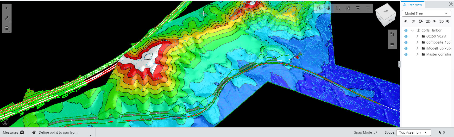
The iModel after thematic display is turned on. It appears mostly one color because the range and color scheme have not been adjusted yet.
2. Changing Thematic Display Settings
Thematic display mode can be customized by creating a new ThematicDisplayProps object and updating the viewport’s thematic display settings. First, create the new object and set different properties like the axis and range to apply the gradient to, and details like the gradient’s colors and number of steps. We used a pre-existing color scheme ThematicGradientColorScheme.BlueRed, but it’s also possible to set this to use a custom scheme and specify key colors with the customKeys property.
Creating new ThematicDisplayProps
const props: ThematicDisplayProps = {
    axis: [0.0, 0.0, 1.0],
    gradientSettings: {
      colorScheme: ThematicGradientColorScheme.BlueRed,
      marginColor: ColorDef.white.toJSON(),
      mode: ThematicGradientMode.SteppedWithDelimiter,
      stepCount: 10,
    },
    displayMode: ThematicDisplayMode.Height,
    range: [-5, 127],
};
To apply the new settings we can first make sure the view state is 3D, which is required for thematic display and allows us to adjust the settings.thematic property. Finally, we can set this property to a new ThematicDisplay object created from our props object so the settings are visible in our viewer.
Adjusting the thematic display settings
const viewportOptionsThematic = {
    viewState: async (iModel: IModelConnection) => {
      const viewState = await iModel.views.load(await iModel.views.queryDefaultViewId());
      viewState.viewFlags = viewState.viewFlags.copy({
        thematicDisplay: true,
        grid: false,
        renderMode: RenderMode.SmoothShade
      });
      if (viewState.is3d()) {
        const displayStyle = viewState.getDisplayStyle3d();
        displayStyle.settings.thematic = ThematicDisplay.fromJSON(props);
      }
      return viewState;
    }
  };
